Mood Board Inspiration: January 2020
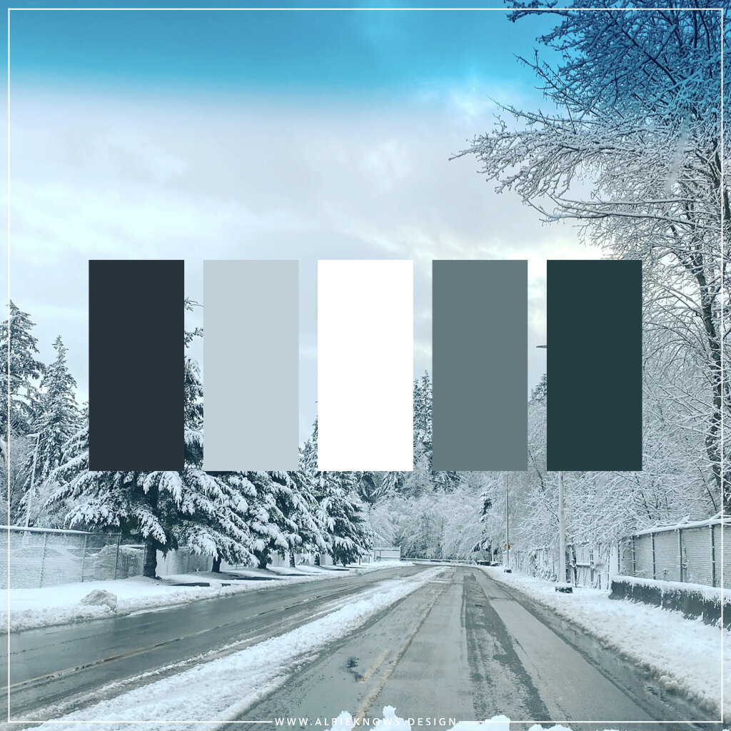
Inspiration can be found in all places, in all things, including driving through a “snowstorm” after picking up the kiddo from school. Cognizant of how design inspiration can be found in the most unlikely places, I decided to start pulling the palettes from the scene — literally just with a color dropper — just to see what colors were really resonating and it was really illuminating.
From one spontaneous moment in time, I was able to capture what really was (is) an amazing color palette.
And now here we are… the first of 12 mood board inspirations for 2020!
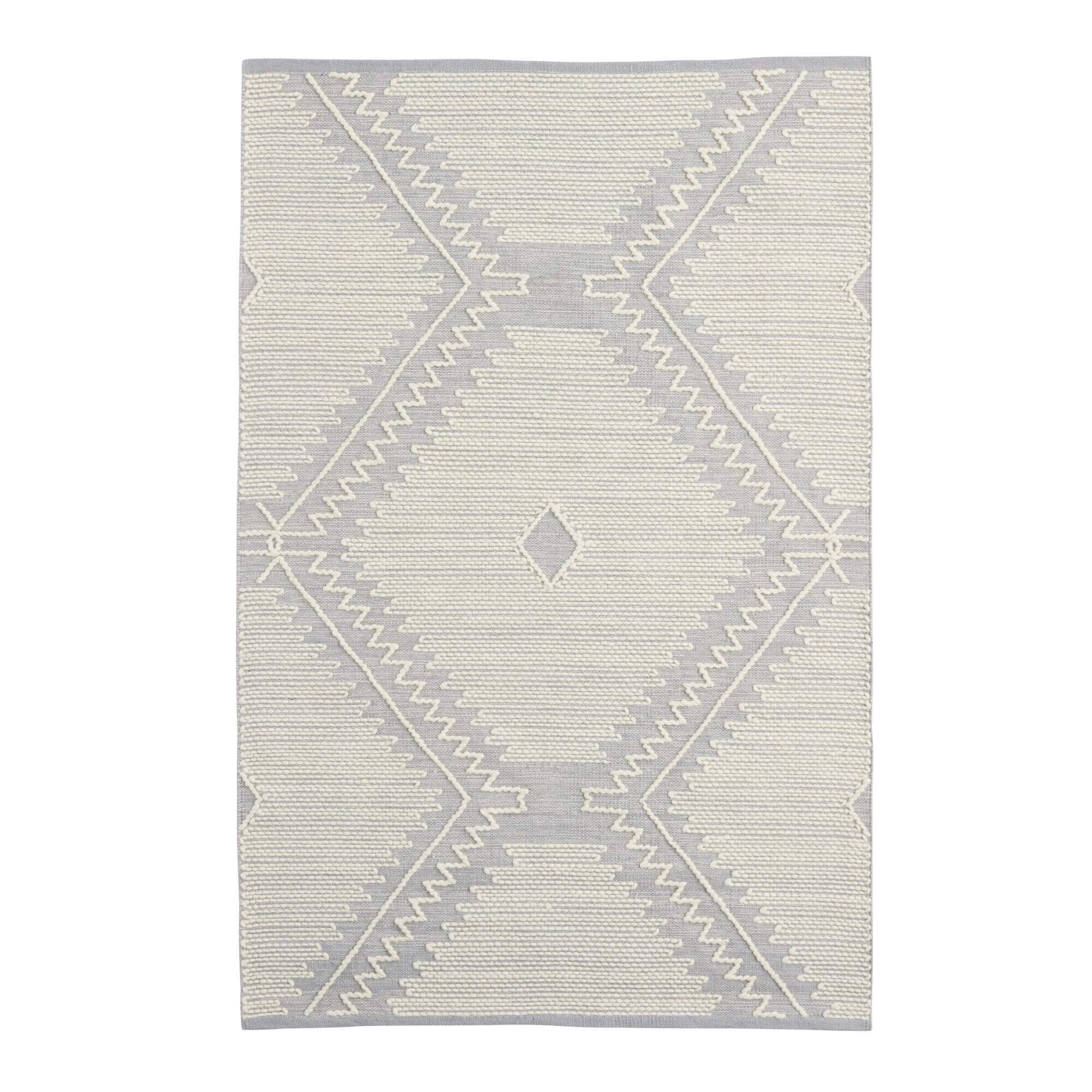
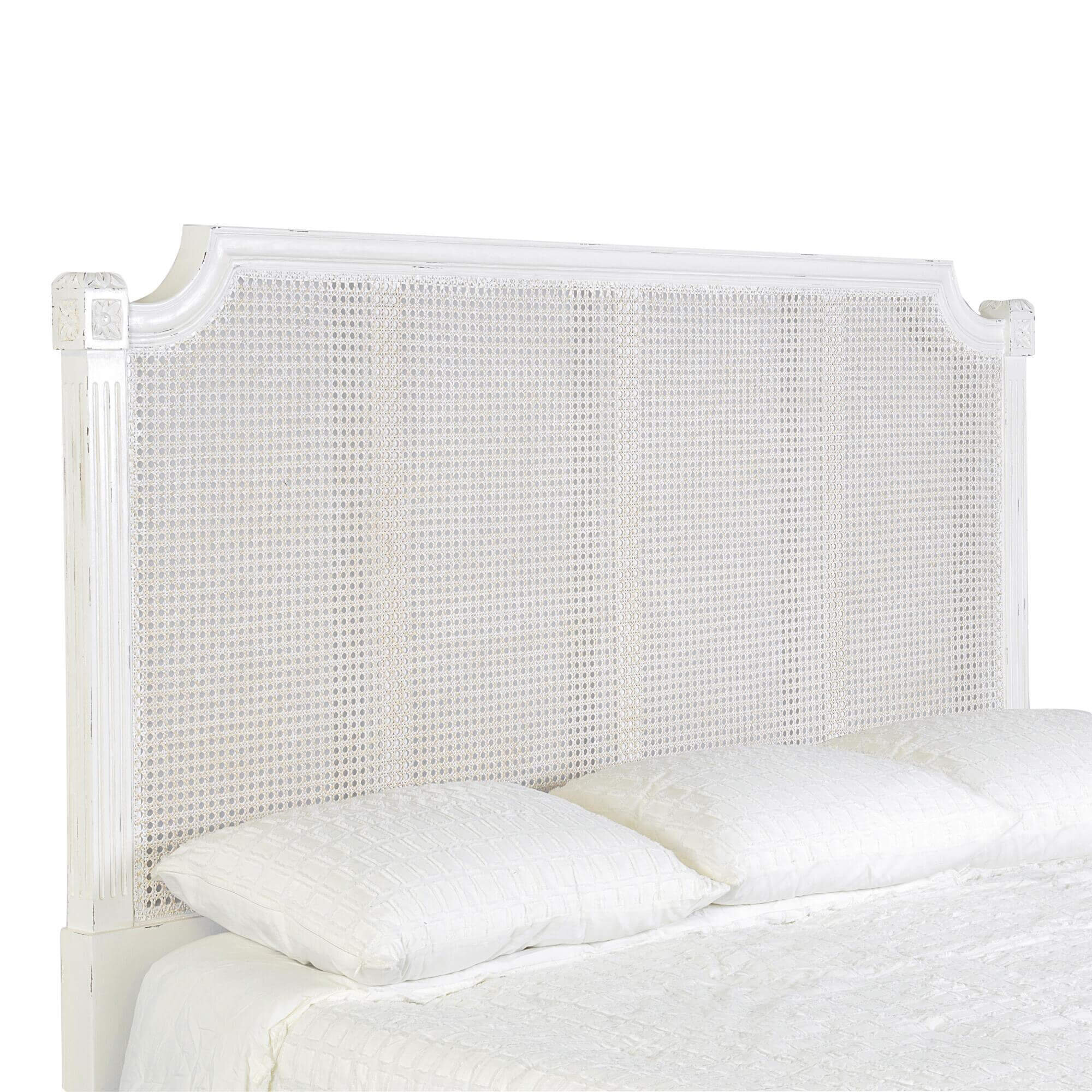
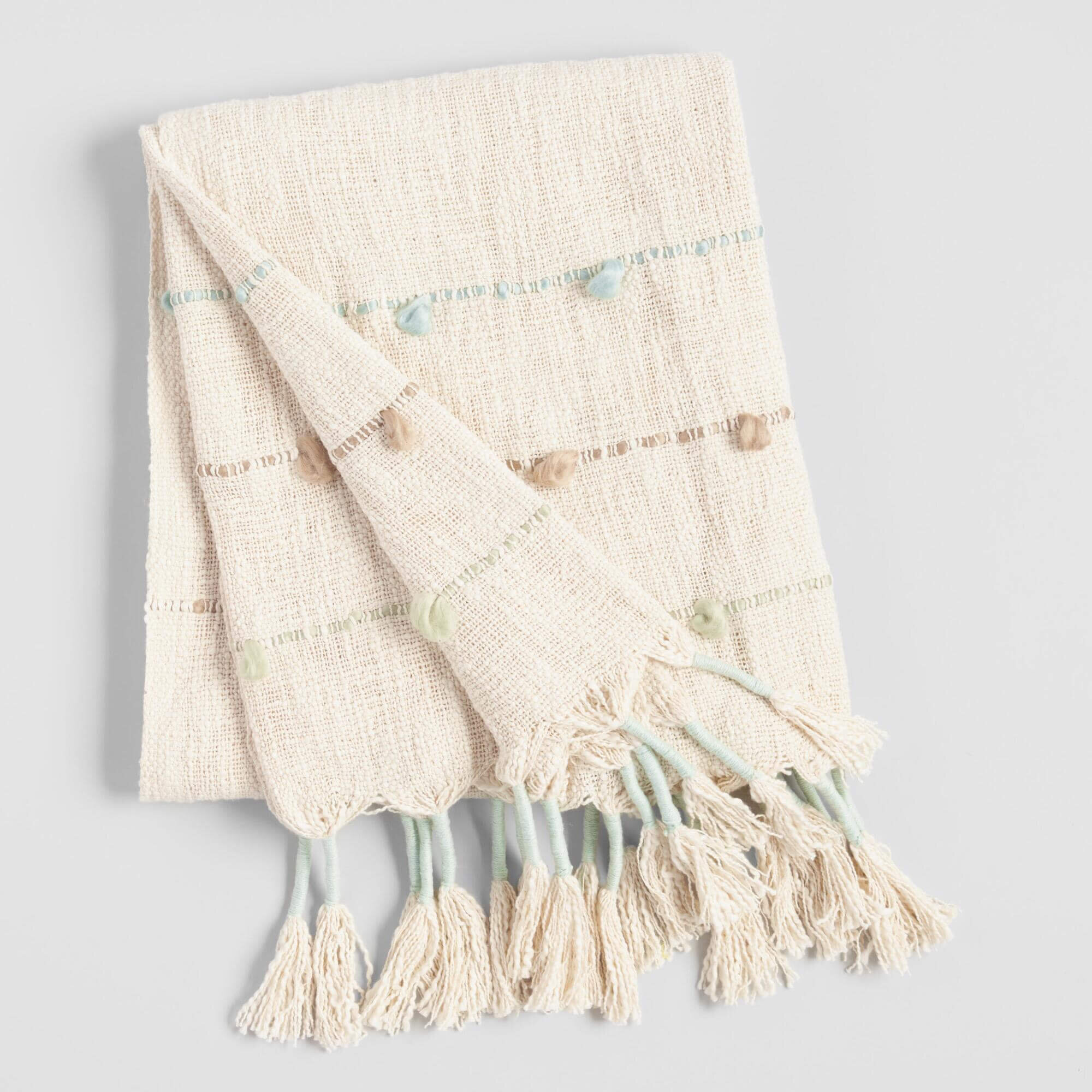
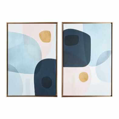
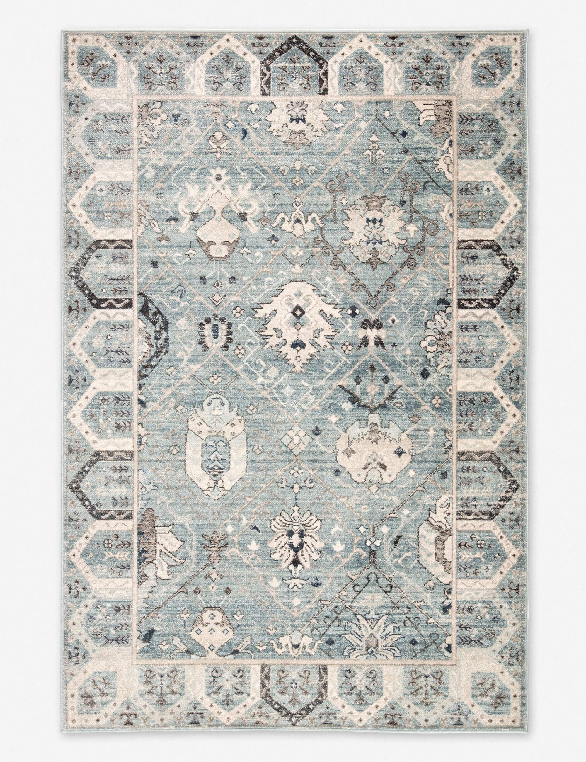
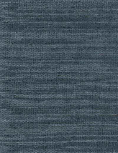
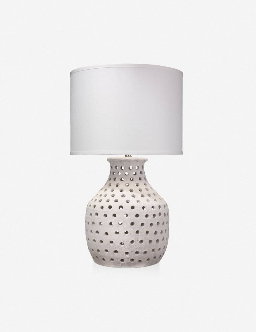
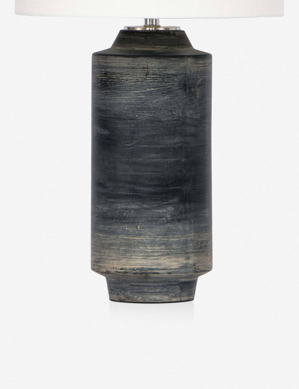
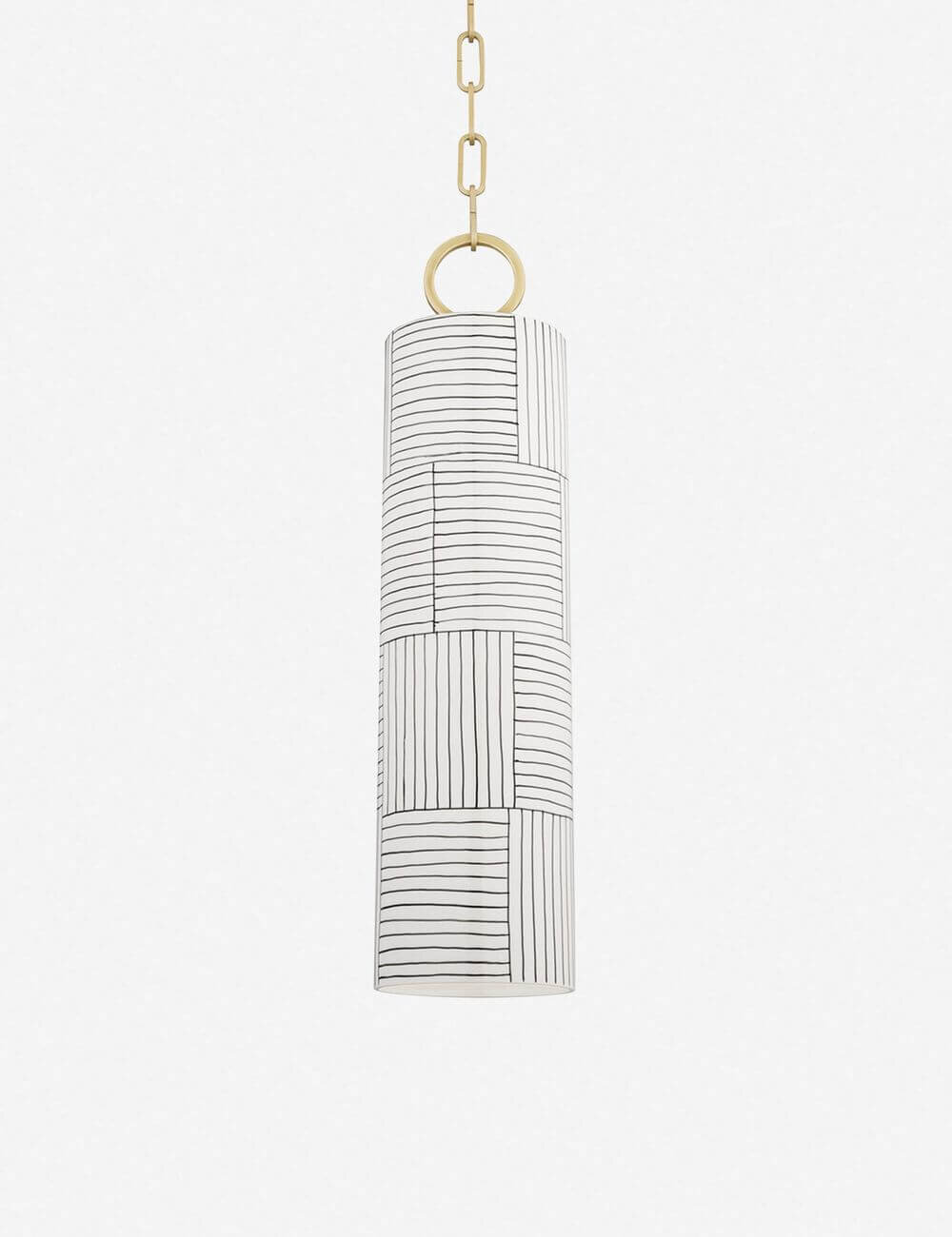
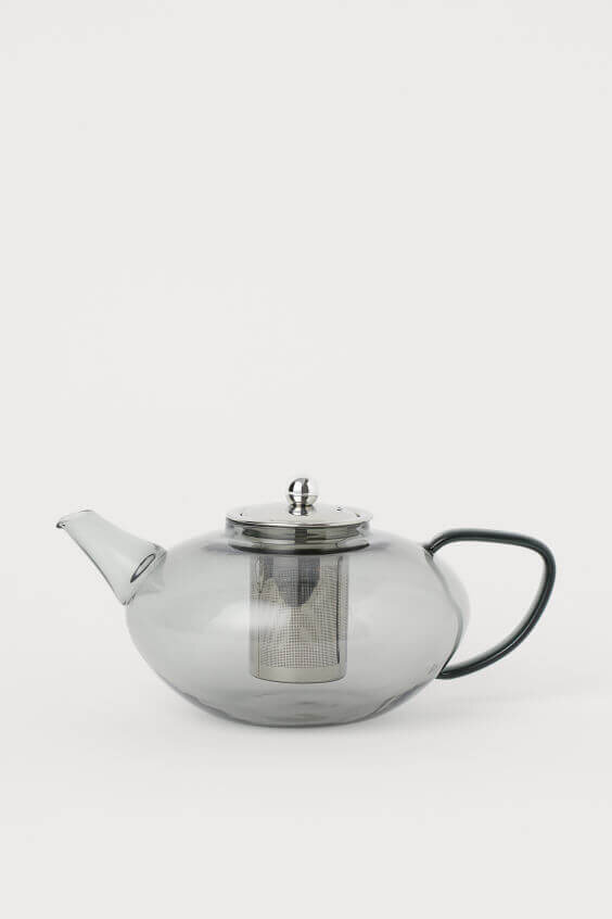
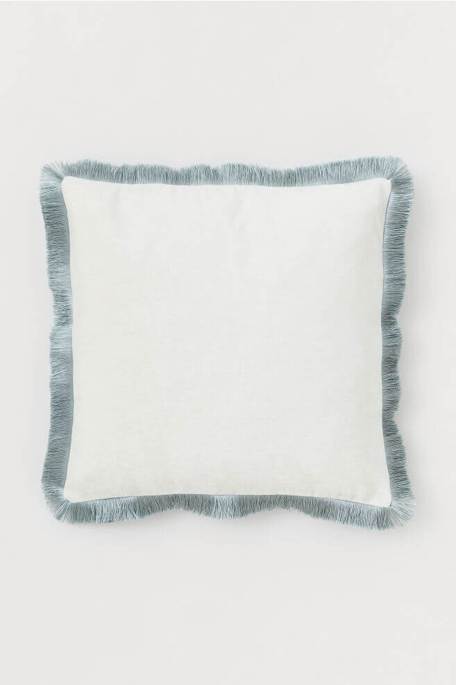
What I absolutely love about this scene is how it effortlessly captures all these gradients of cool tones, truly illustrating the beauty of the winter season. This is a palette that could easily translate into any home space — whether you’re looking for a clean & modern aesthetic, or something a bit more collected & textured.
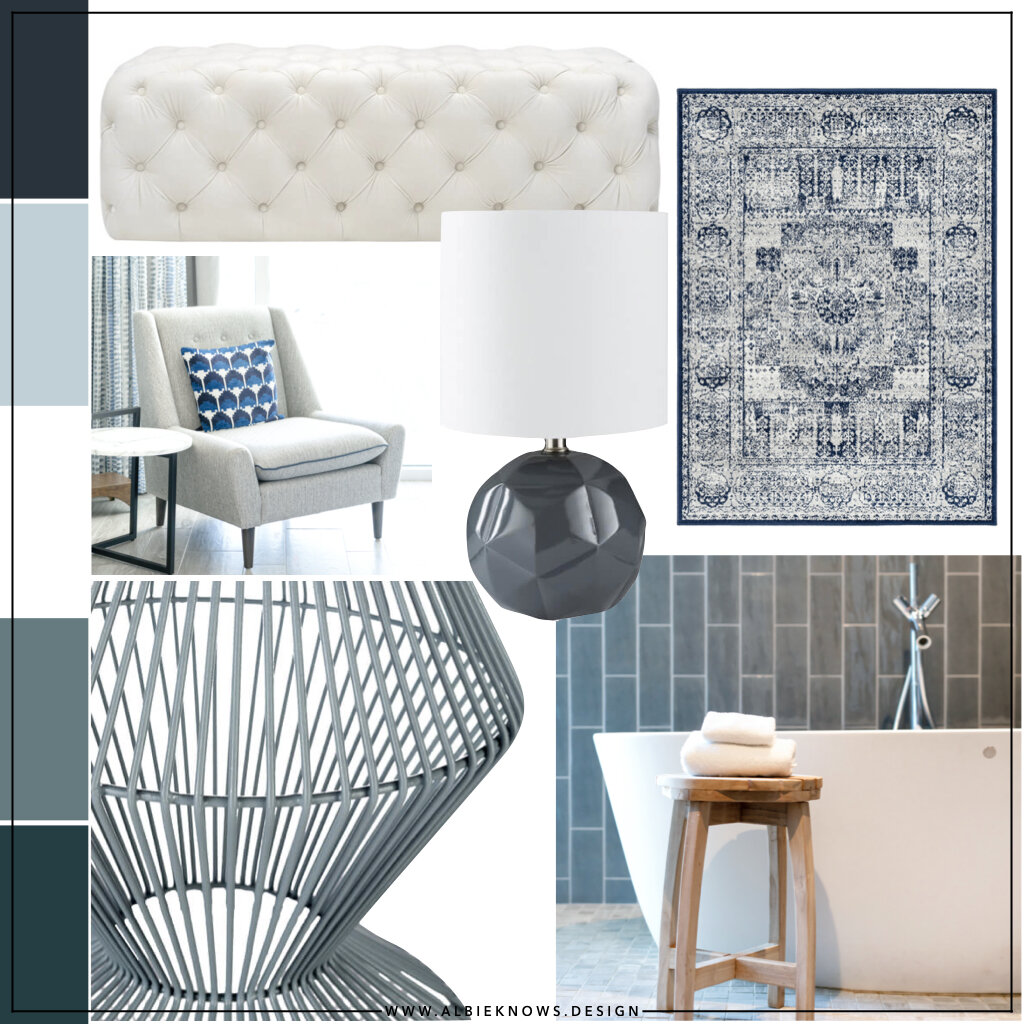
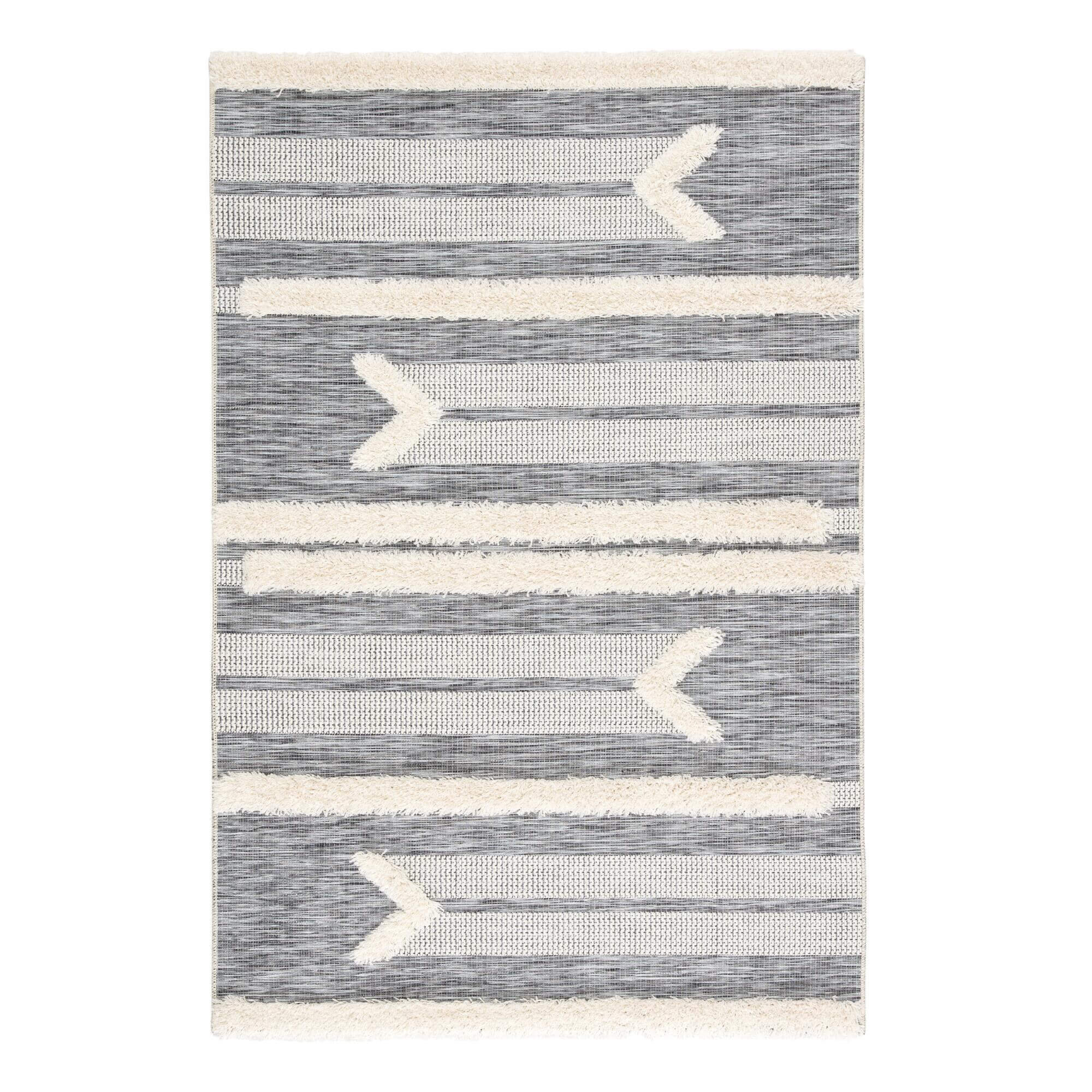
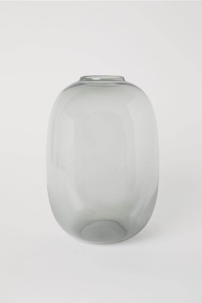
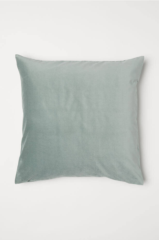
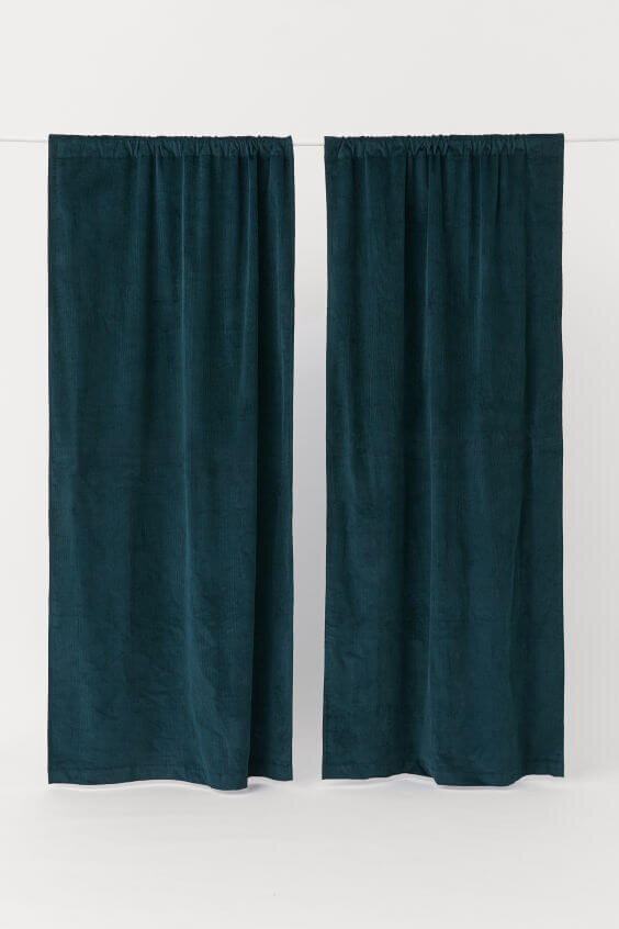
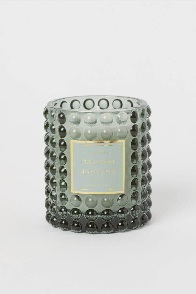
The tones play well with one another in a way that isn’t monotonous or sterile, but when shopping this palette for your home, how do you actually pull this off? How do you shop for this type of palette so that it feels intentional and layered? Shopping some of my favorite retailers — Cost Plus World Market, Lulu & Georgia, and H&M Home — for pieces that align with this aesthetic meant curating the search for cozy, cool, and neutral tones…

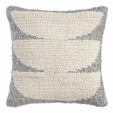


I am totally biased — I love winter and I love cool tones — but my favorite thing about this palette is how it can easily be transitioned into the other seasons by adding pops of color and swapping decorative elements throughout the year. This definitely isn’t a palette you have to be married to but it’s definitely a great fresh start to the new year.