Mood Board Inspiration: October 2022
And now we enter the final quarter of the year... sheesh! The other day I said to a friend that this year has felt both rushed and exceptionally long. September was especially trying... like I was taking a brutal final exam, without ever having stepped foot inside the class. Having survived September's 30 day bootcamp makes rolling into October feel like a mental salve. And if I'm honest, all of Q3 was trash, so this new quarter is also a welcome gift.
With it being officially full on Fall, you're probably expecting a palette of rich jewel tones; or maybe because it's the month of Halloween, you're expecting moody neutrals. Nope. ICYMI... last month, I picked up where I left off with this mood board inspiration series in 2020. All of my mood boards for September through December had already been created, just never published. Resuming the series now, two years later, meant there was no guarantee the mood board I'd created then still reflected the inspiration vibes I'd be going for now. As luck would have it, the mood board palette I selected for Oct. 2020 perfectly aligned with my present feelings of rejuvenation, growth, and determination.
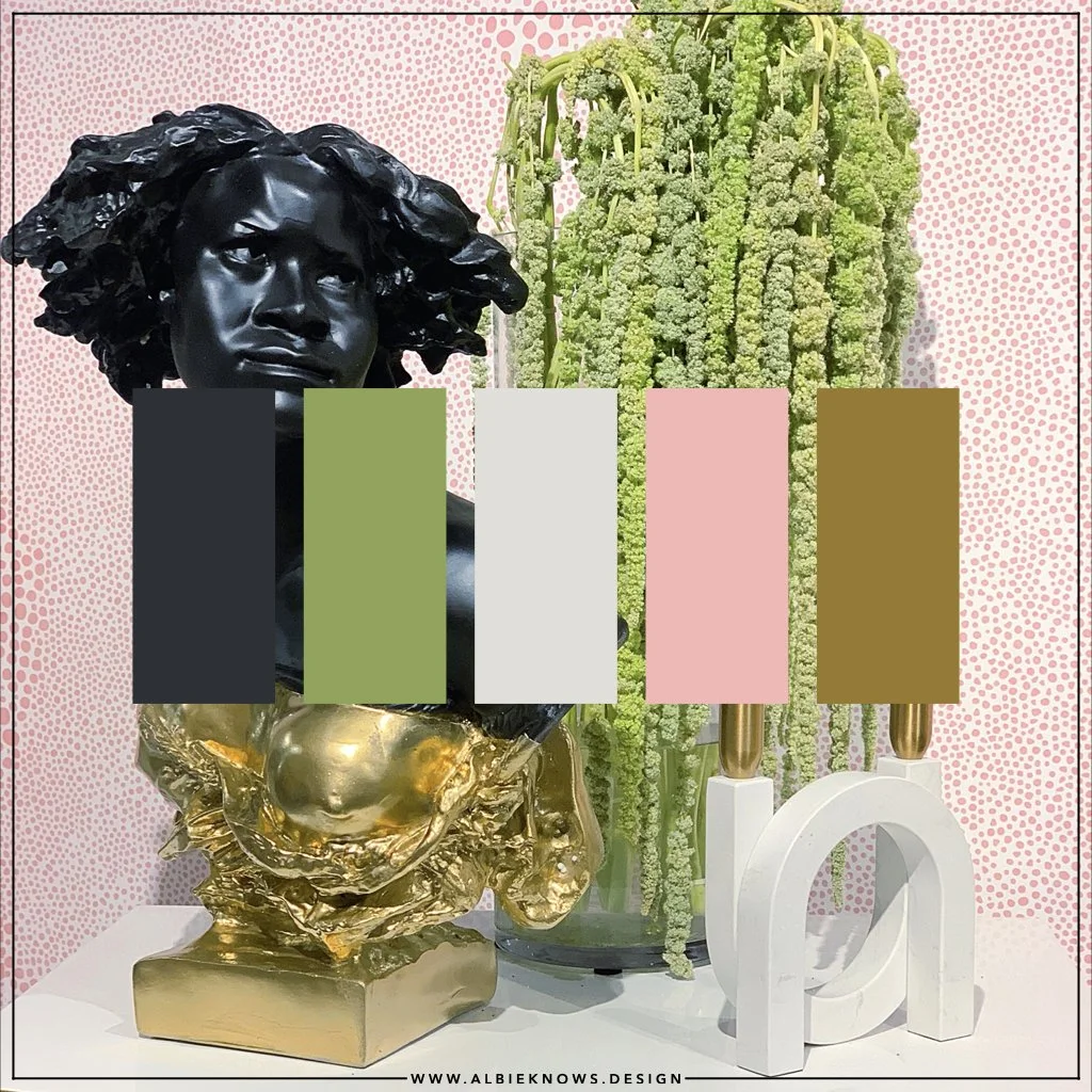
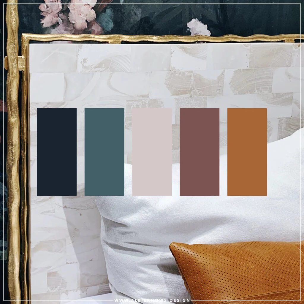
The inspiration image is one I'd capture while at High Point Market in 2019 - a vignette from Keia McSwain's Showhouse in a Showroom installation for Alden Parkes, featuring a bust custom painted by Danielle McKim.
This vignette illustrates to me a balance of strength and softness, which is also my wish for all of us going into the final quarter of the year.
For most, these hues may seem more in alignment with the Spring season; however, the delicate balance between light & dark - the expected & unexpected - is exactly why I made this palette selection. Be it in furnishings or fashion, when these colors meet, they can represent so much of what we associate with Autumn... even though it may not seen that way at first. While I didn't realize it at the time - or maybe I did subconsciously - these are colors that I have also been most drawn to recently even in my wardrobe.
The basics of color theory provide some insight into why these colors not only work together, but why they also work for the season...
BLACK draws the eye and can add drama to any space.
In addition to representing harmony & growth, GREEN is synonymous with nature. During a season when nature is known to be bare, designing with green is a great visual alternative.
While the GREY in this palette has a subtle green undertone, the color in & of itself is known for being a transition color.
PINK, while often written off as a "feminine" color, it represents universal love & kindness... indicative of a softer side of design.
BROWN, like green, is representative of nature and in alignment with the warmth of the season.
In summary, this palette is giving us drama, growth, nature, transition, softness, and warmth. Sounds like Autumn to me.

When I see this inspiration board, I am reminded of what I want the coming weeks to feel like - I want them to be soft & kind, while also allowing for endurance & assertiveness. I want this new season to be like a warm embrace... and I dunno about you, but for me, the best hugs are both strong & delicate... like this palette.

With a multitude of applications, there is no shortage of ways to introduce these colors into your home & lifestyle - wallpaper, rugs, tablescaping... even in your footwear. Whether it's a major overhaul or a season refresh, you're covered.
As I think about updates I'll be making around the hygge ranch in the coming months, in addition to just changes I want to see in my life, this palette feels very apropos... a quiet air of excitement & expectation. I'm looking forward to the month ahead, with a new appreciation for the unexpected.