5 Easy Steps To Choosing Color
How To Use Color Theory To Simplify Your Color Selection Process
ORIGINAL POST DATE: 06-13-2018
UPDATED NATIONAL COLOR DAY 2021
So often when I'm working on a design the biggest dilemma tends to revolve around color — picking colors, matching colors, using colors — so I thought it be cool to share some of my "wisdom" on color! When I used to do client work, color would also almost always be at the root of the client’s indecisiveness, as they struggle to understand how colors play together and the impact different colors could have on their spaces… and more importantly, on themselves.
Because, to be clear, Colors Have Feelings Too!
Although this can definitely vary from culture to culture, colors can effect our moods while also allowing us to show off our passions & personalities in a way that’s tangible.

Choosing color is more intuitive & creative than it is scientific, however, color theory must still be taken into account, especially when looking to combine multiple colors in a single space. Whether you’re choosing colors to paint your walls or for decorative accents, the feelings of the colors are just as importance as decoding the hues & undertones.
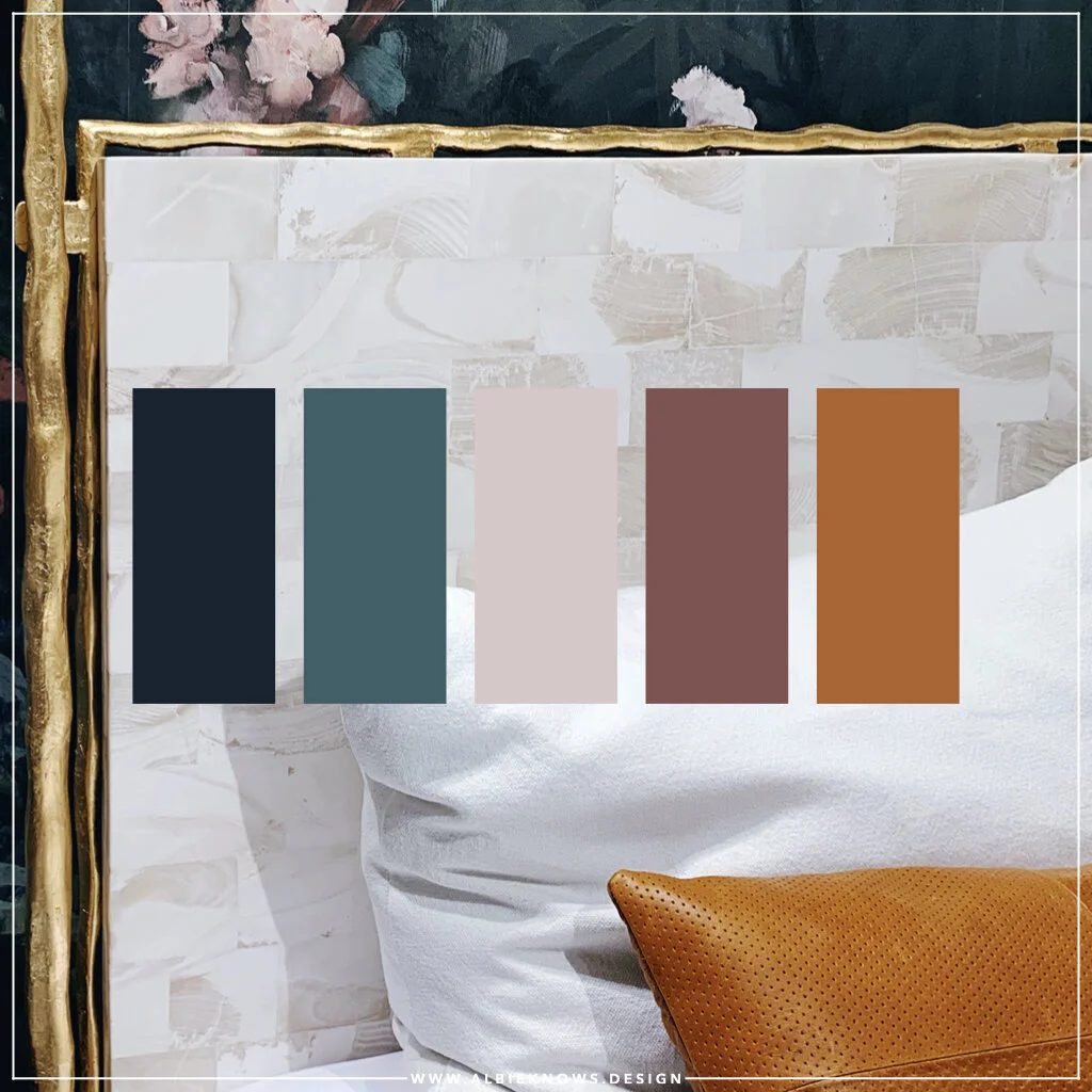
When designing, you start with choose 2-3 colors that compliment one another, your personality, and the mood you want to set for the space… while also drawing inspiration from existing pieces.
It is perfectly okay to experiment with different shades of the same color — they exist for a reason! — however, how can you ascertain which colors will give you what you need without knowing what they might mean for you in your space?

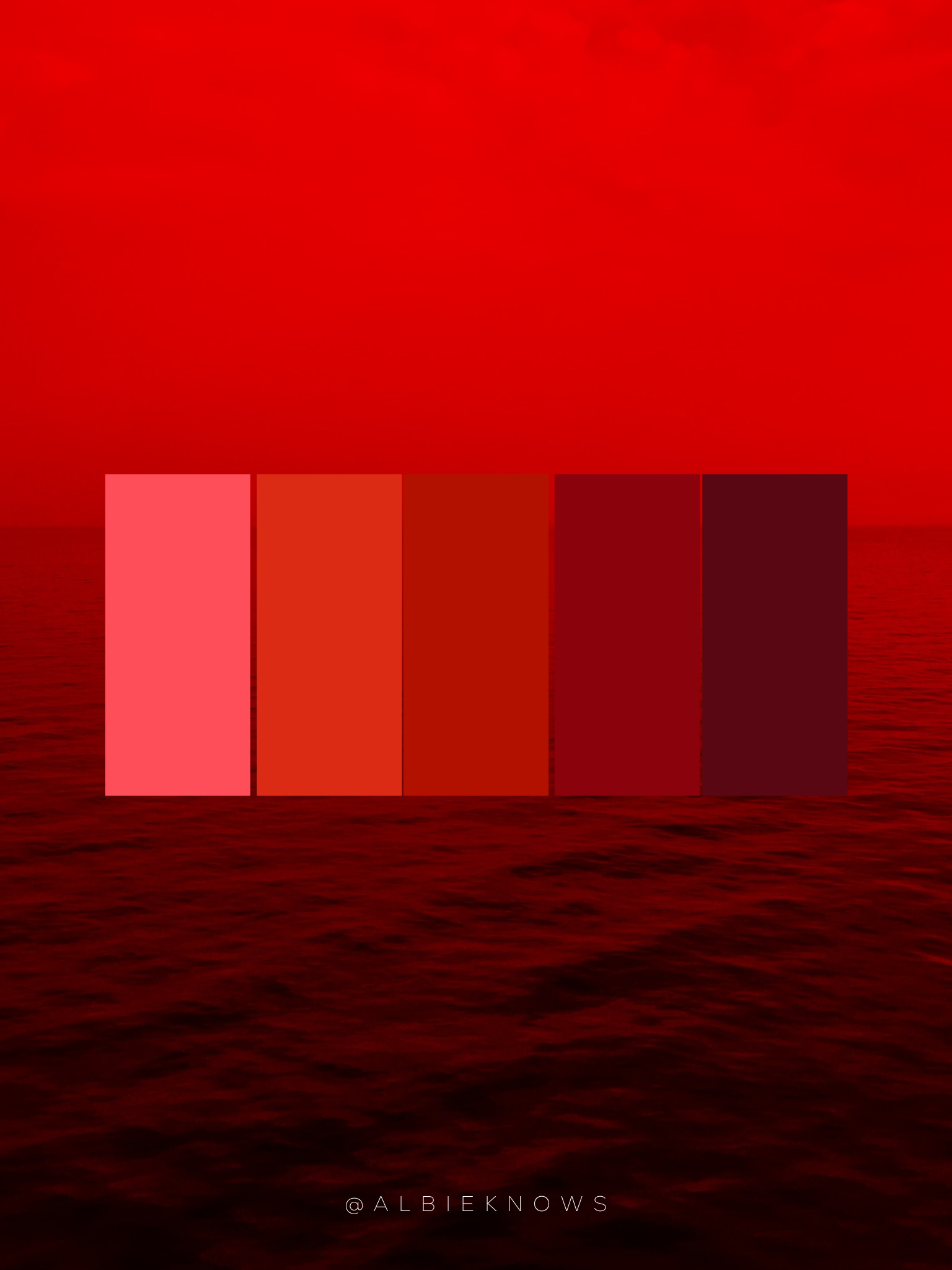
RED
associated with enthusiasm, passion, and power; and conducive to warmth & intimacy

Orange
associated with optimism & innovation; best in small doses

Yellow
associated with being creative, cheerful, and happy; can invoke feelings of peace in a neutral setting

Green
associated with harmony & growth, and a great color for connecting with nature

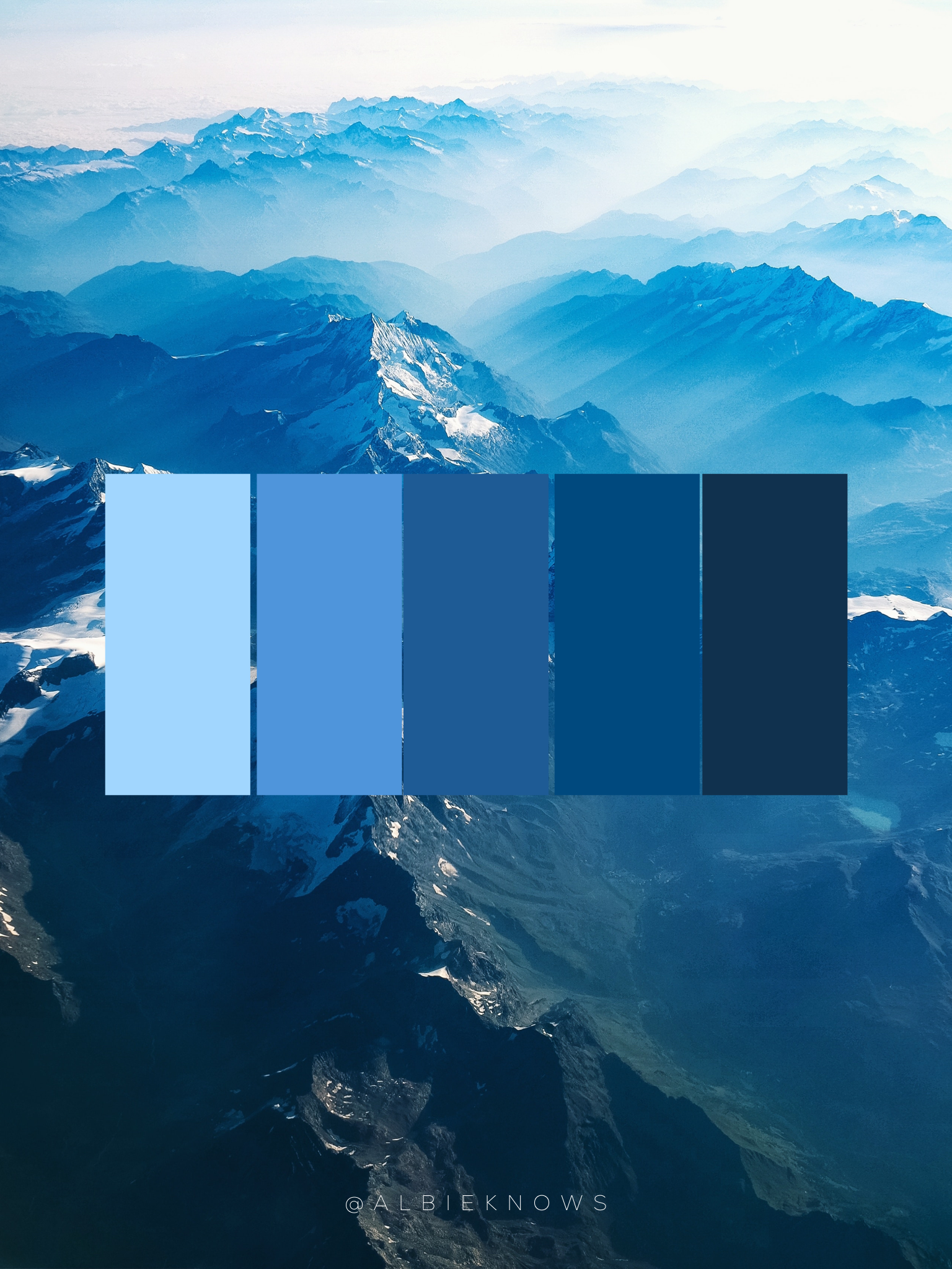
Blue
a "cool" tone associated with loyalty & peaceful feelings, making it great for creating a calm environment

Purple
associated with creativity & imagination, whie also possessing the traits of its base colors, red & blue

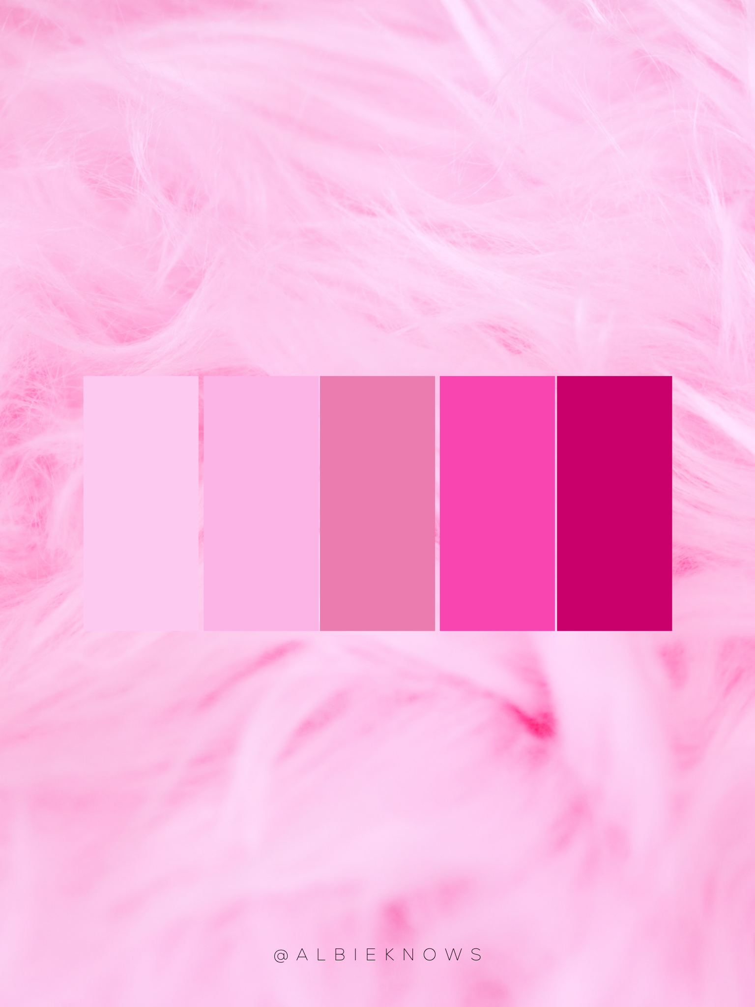
Pink
Associated with universal love & kindness, not to be confused with its more passionate & fiery red base

White
associated with purity, perfection and innocence so perfect to building a palette that is serene & neutral

Grey
associated with lacking in emotion & impartiality; translation: a great transitional color

Black
everything white isn't — dark, hidden, and complex, making it perfect for drawing the eye & adding drama to any space

Brown
Associated strength, comfort, and resilience, this family is neutral hues is grounding, like its earthly inspiration.
Metallics
Silver: like grey, it's an adaptable color, yet with an air of mystery
Gold: associated with elegance & extravagance, perfect for adding glam touches to any decor
Now obviously these aren't the only colors available, however, every color will fall into one of these 3 categories — neutrals, warms, and cools — denoting that certain colors and color groups can truly set the "tone" for the space. If you’re uncertain when building a color palette, you can start with neutrals, for example, and build with pops of color in pieces that you can easily switch out later as you’re editing your design.
How Do I Choose Colors?
I believe in choices so I always create a palette centered around multiple colors — 2 to 3…sometimes 4 — with a primary color for marquee pieces that'll anchor the design, complimentary accent color(s) to break up any monotony, and a contrasting dramatic color for pops that I can thread throughout the space.
Albie Fact: This is a technique I picked up in my past life as a visual merchandiser.
I never wanted the customer's eye to wander in a million different directions, but I also never wanted them to walk into my shop and feel underwhelmed; it was always about finding the perfect balance to draw them in & subtlety have a story unfold in front of them. It's the same when I'm designing interior spaces — you want to feel at ease with what you’re seeing, not overpowered by an assault of color or bored with the lack of.
Let me clear though…
There are no hard & fast rules for choosing color.
In summary, However, my most helpful tips would be:
choose core colors that compliment one another, as well as your personality & the mood you want to set for the space
draw inspiration from your existing pieces (or even wishlist items) & build around it
don't be afraid to play with the different hues within a color family
be it in store or online, request paint chips & fabric swatches in advance…if especially if you have a fear of commitment
start with neutrals and gradually introduce colors based on the other 4 steps

PIN FOR GOOD VIBES!